When I first heard about Arc, from the Browser Company, I thought, who would want to get in the browser game? It seems like there are enough Chrome-based browsers on the market to suit any internet lifestyle. I was fortunate enough to get an invitation to their private beta, though, after mentioning my interest in checking it out. Now that I'm using it, I think I understand where the Browser Company is trying to go with their new offering.
The browser chrome in Arc is powerful enough to adopt now common concepts like spaces (or tab groups, or containers, or whatever your browser of choice calls them), but nimble enough to get the chrome out of the way when it's not needed. Arc even eschews the standard URL box at the top of the page in favor of a smaller field on the left-hand side that expands when you click into it. The tab structure is vertical, and has what I love about the Edge implementation of tabs (without the fact that Edge forces everything to open in a new tab until your screen blows up). Tabs are automatically archived once a day, which you can change, unless they are pinned or marked as favorites.
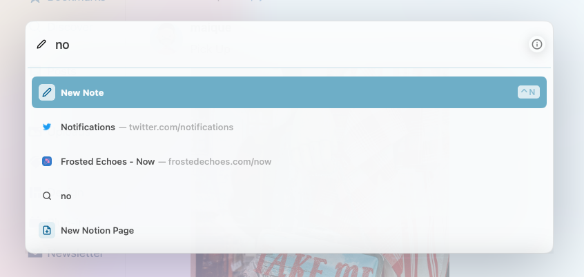
The site window is set apart from the chrome by some nice shadowing and feels like an entity unto itself. When you collapse the sidebar, the site you are on feels like a proper web app. Arc even has a command palette for looking up web pages, creating notes, capturing and marking up screenshots, and playing with extensions (it comes with uBlock built-in).

The browser documentation is shared via Notion, and the browser looks like it has some deep linking into the popular notes app via the command palette. It also has deep linking into Google and Outlook calendars in that you can get your appointment notifications in app. With the matching email clients, you can see your new messages from a pop-out widget and even click to compose a new message. I have yet to play around with that functionality, but in theory it could get web apps for calendaring closer to parity with desktop and mobile apps.

The notes app that is contained within Arc feels pretty basic (which puts it firmly in line with a lot of browser-based notes apps). While Arc has the surprising ability to copy a URL as Markdown from the URL box, the notes feature doesn't use Markdown, which seems like a miss. For instance, when I'm taking notes on a page, I quite often want to capture quotes, but the block quote isn't supported by Markdown formatting or the minimal WYSIWYG editor. Dark mode is also rudimentary in its implementation, with the bright transparent sidebar glaring at you, but perhaps these are early days for that functionality. I try to keep in mind that this is still just a beta. In fact, there is a way to report bugs straight from the command palette, and you better believe I will put that to good use.
Arc feels simple to jump into, although they really push you to make it your default browser, promising additional functionality if you do. It also feels robust enough for power users to continuously find new things to fiddle around with and craft a workflow out of. It's pretty polished for a private beta, and — if you are on a Mac — I would recommend checking it out when you are able (Windows version coming soon).